Moussey Moussey Cafe Redesign (Concept)
My Role
UX/UI designer
Tools
Figma
Timeline
3 days
The Opportunity
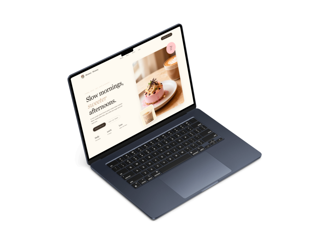
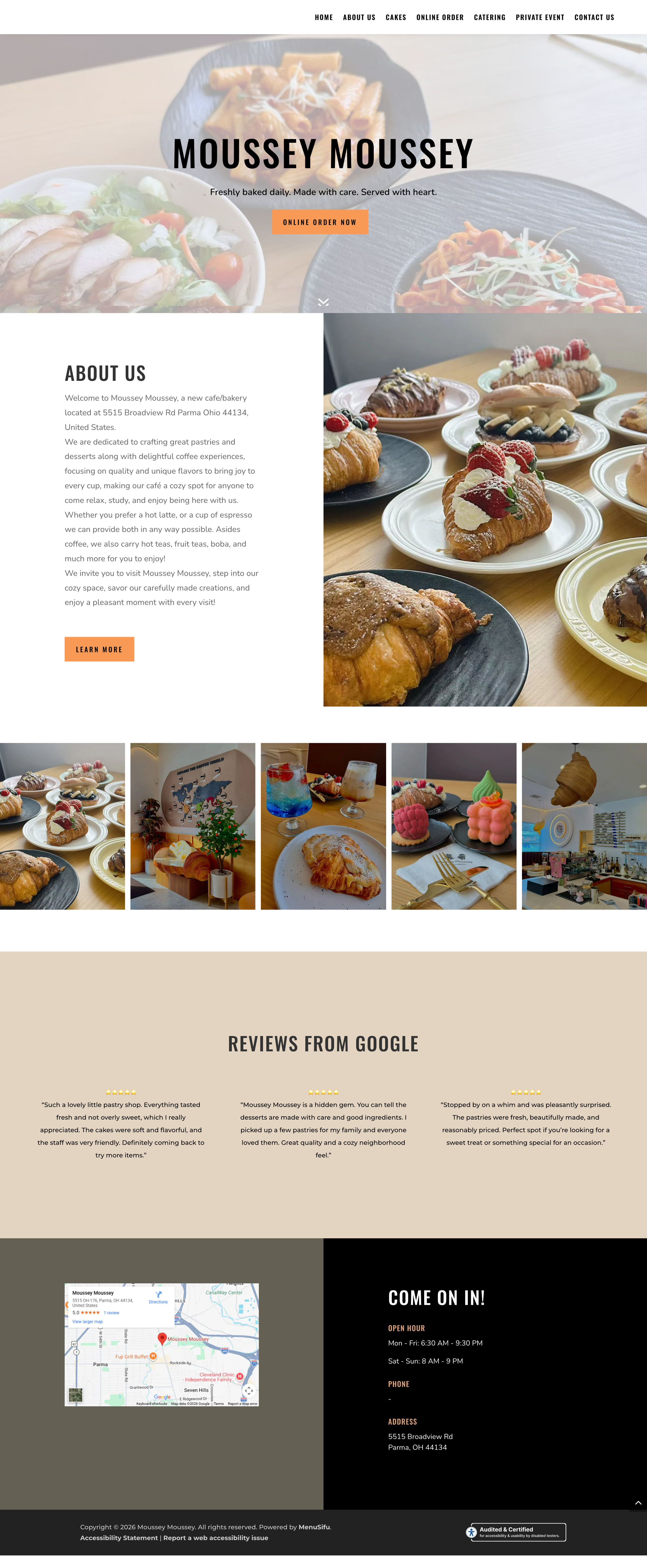
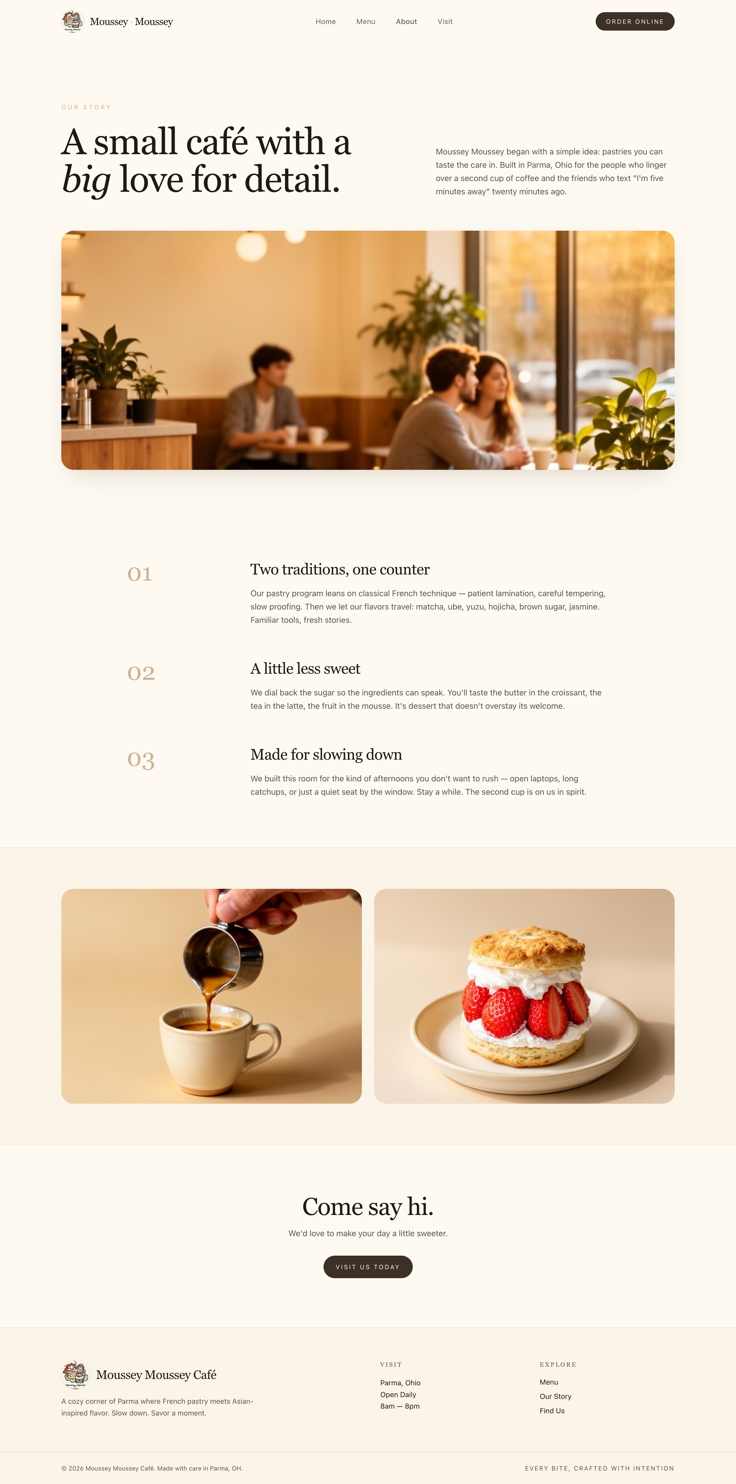
A strategic website redesign for Moussey Moussey Café aimed at transforming a basic, information heavy site into a refined brand experience. The redesign focuses on elevating the café’s visual identity, improving content structure, and creating a warm, inviting atmosphere that reflects the in person experience. By balancing storytelling with clear navigation and calls to action, the site guides visitors seamlessly from discovery to exploring the menu and placing an order.
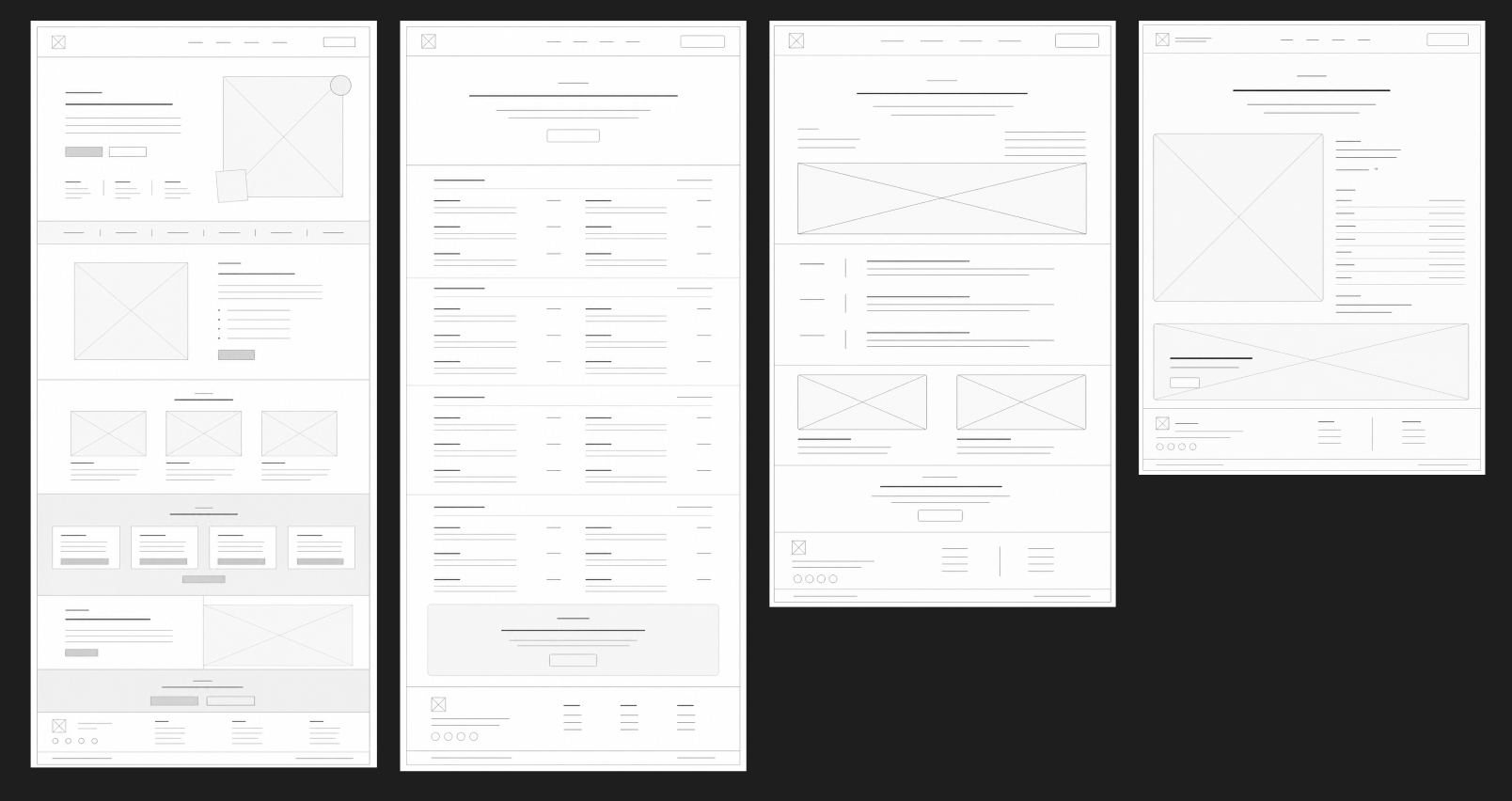
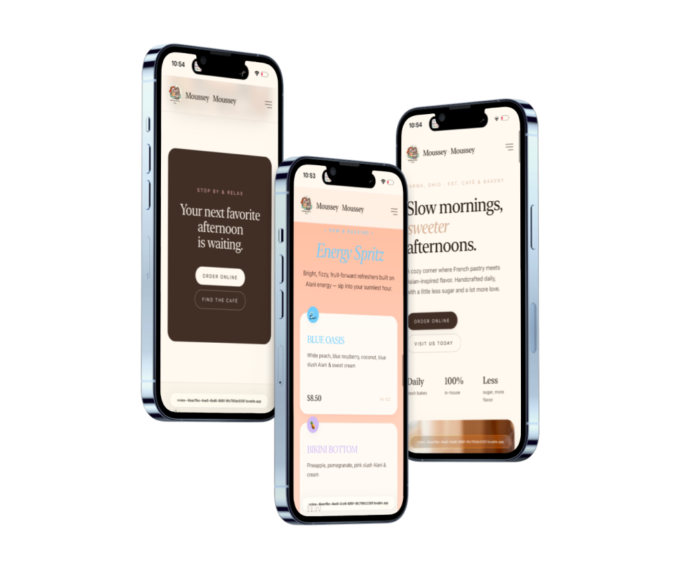
Wireframes were created for four key screens to map out the overall structure and user flow of the site. This phase focused on organizing content, establishing a clear hierarchy, and ensuring a seamless experience as users move between pages and toward key actions.
Existing Experience & Opportunities
The original Moussey Moussey website lacked clear structure and visual hierarchy, making it difficult for users to quickly understand the brand or navigate key information. Important sections like the menu, ordering, and location were not clearly prioritized, forcing users to scan through content rather than being guided naturally.
The design leaned heavily on functionality over experience, with limited emphasis on atmosphere, storytelling, or brand identity. While the café itself offers a warm and inviting environment, the website did not reflect that same feeling, resulting in a disconnect between the physical space and the digital presence.
Additionally, the site lacked a strong user flow, with minimal direction toward key actions such as visiting in person. Content felt scattered, and the overall experience did not effectively build trust or encourage engagement.
Improve overall content hierarchy to make key information easier to scan and understand.
Highlight important actions like viewing the menu, ordering online, and visiting the café.
Elevate the visual design to better reflect the café’s atmosphere and brand identity.
Create a more engaging, experience driven homepage rather than a purely informational layout.
Ensure consistency in layout, spacing, and typography across all screens
Make the site feel more modern, polished, and trustworthy to first-time visitors
Project Goals
Solutions
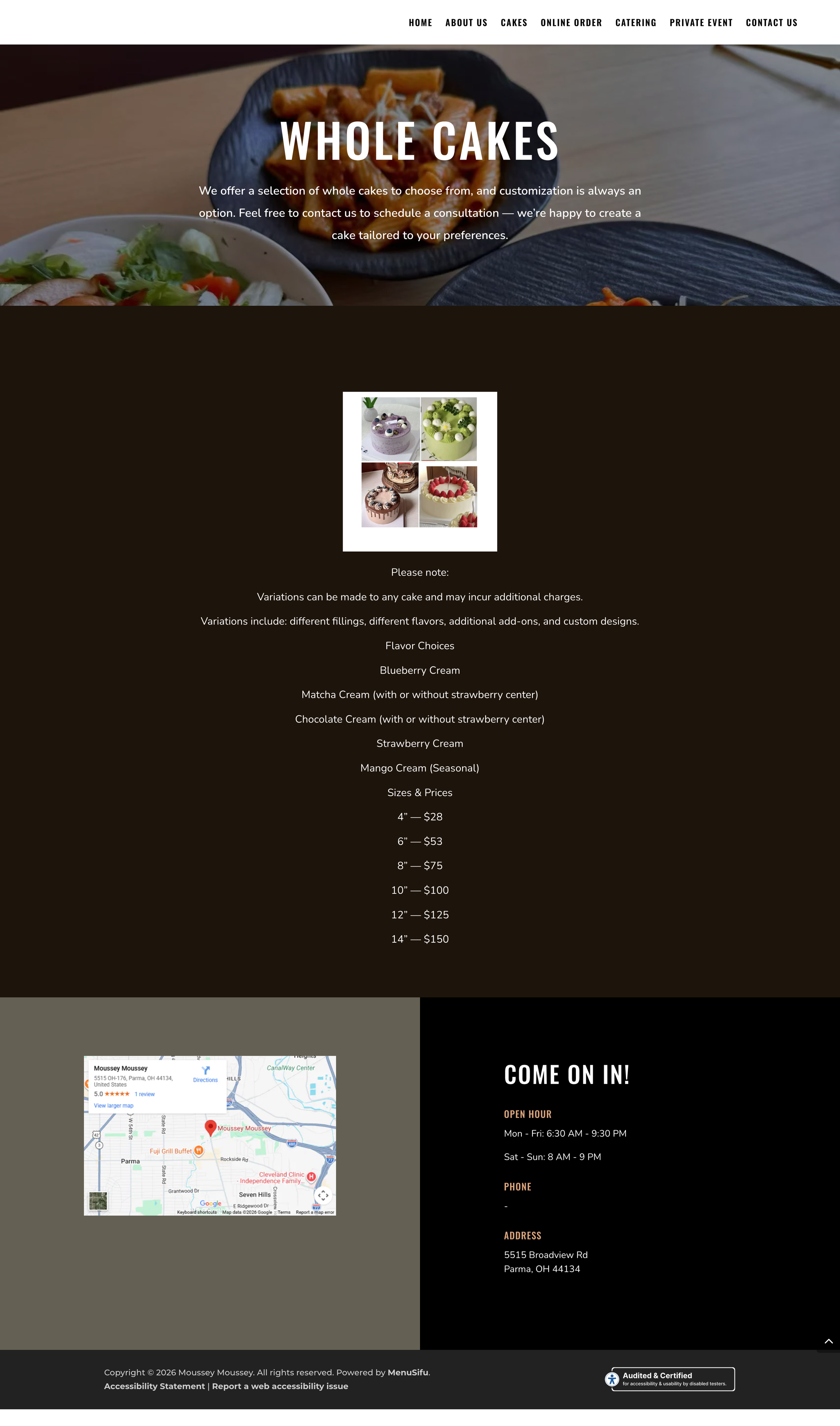
The redesign introduces a more intentional layout with stronger visual hierarchy and improved spacing to enhance readability. Content is organized in a way that prioritizes key information, while consistent styling and imagery help communicate the café’s atmosphere. Clear calls to action and a more defined user flow make it easier for visitors to navigate the site and take action.
My Approach
The redesign began with analyzing the existing website to identify gaps in structure, hierarchy, and overall user flow. From there, wireframes were created for key screens to establish a clearer layout and organize content more effectively. The focus was on simplifying the experience, prioritizing important information, and creating a natural path that guides users from first impression to action. Once the structure was defined, visual design was applied to elevate the brand’s identity and better reflect the café’s atmosphere through typography, spacing, and imagery.
Conclusion
The final design delivers a more structured, visually refined experience that aligns with the café’s brand while improving usability. By introducing clear hierarchy, stronger navigation, and intentional calls to action, the site now guides users more effectively toward exploring the menu, ordering, or visiting in person. Overall, the redesign transforms the website from a basic informational layout into a more engaging and conversion-focused experience.