VCN Clothing Website (Concept)
My Role
UX/UI designer
Tools
Figma
Timeline
3 weeks
The Challenge
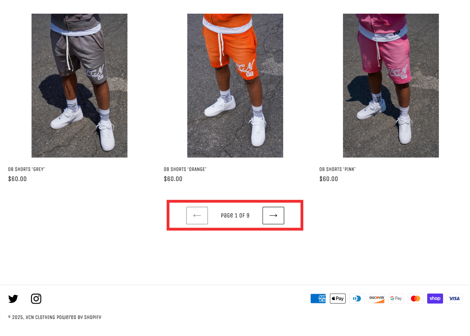
The original VCN Clothing website lacked basic e-commerce structure. There were no product categories or filters, forcing users to scroll through up to nine unorganized pages just to find a single item. This made the shopping experience tedious and frustrating. This led to poor engagement and likely lost sales.
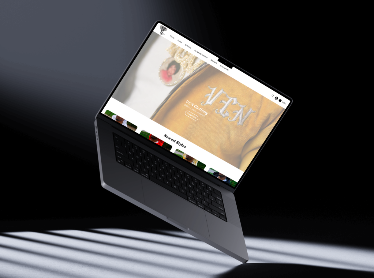
Proposed Solution
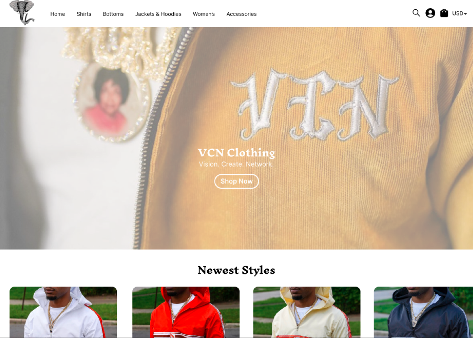
The goal was to redesign the website with a clear, intuitive structure that improved usability, reduced cognitive load, and aligned with the brand’s creative identity. I focused on simplifying the navigation bar, add and organize categories logically, and introducing a modern visual layout that highlighted products and calls to action. The redesign also aimed to improve the shopping experience.
The Initial Site
The original VCN Clothing website lacked a proper e-commerce structure. There were no product categories or filters, forcing users to scroll through up to nine unorganized pages just to locate a single item. This made the shopping experience tedious and frustrating, resulting in poor user engagement and likely lost sales.
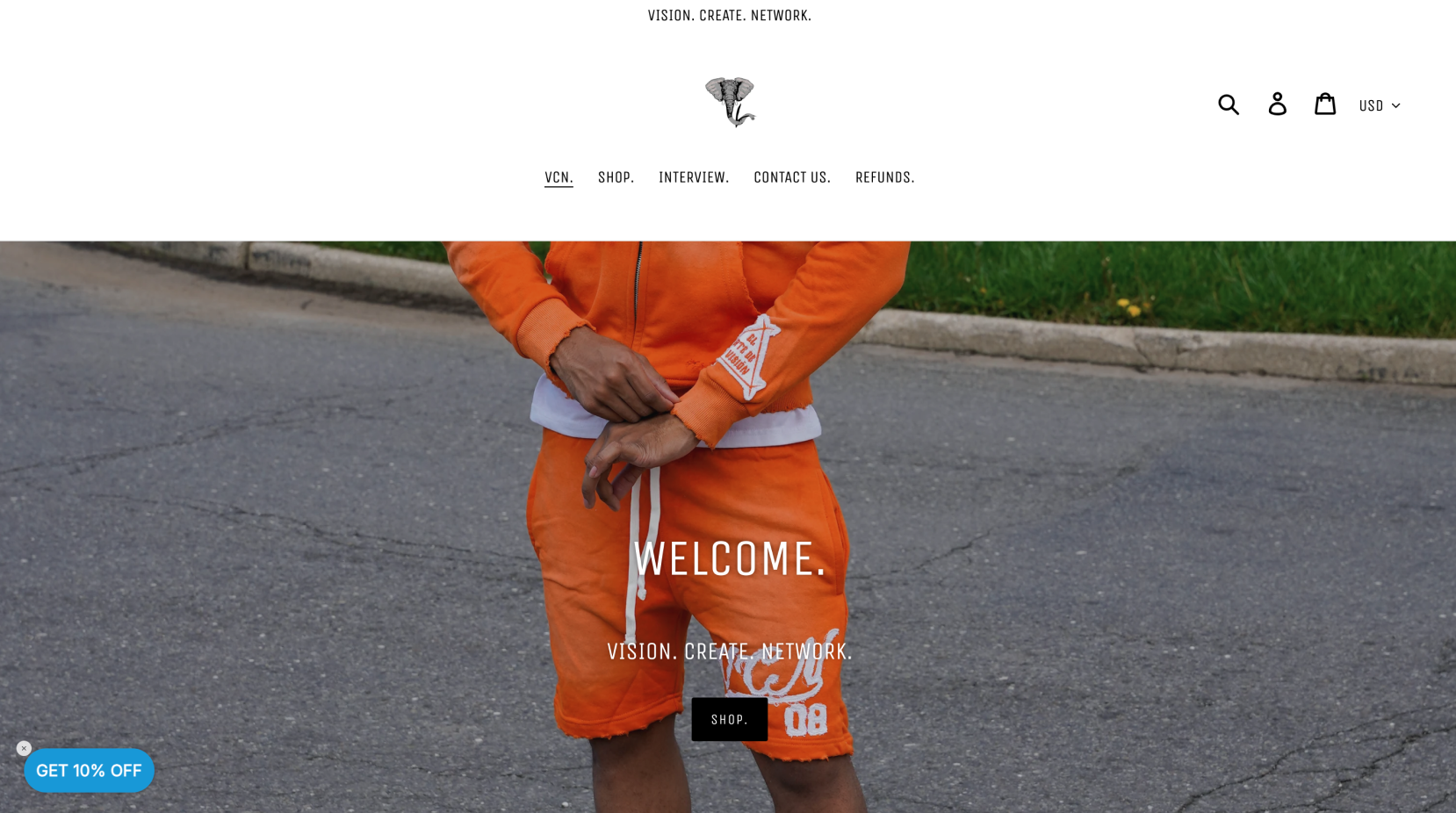
What I noticed
The “Shop” button was the only entry point to the product catalog, which led users to nine unfiltered pages of items. With no categories or filters, customers had to scroll manually to find specific products, making the shopping experience frustrating and time consuming.
Solution
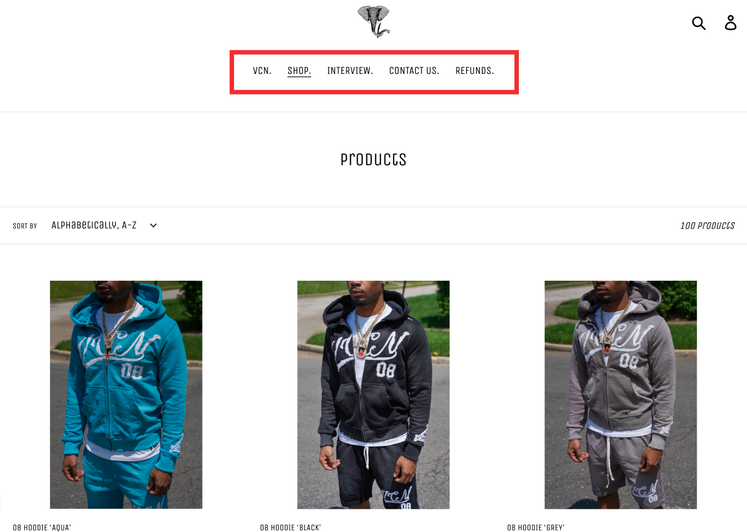
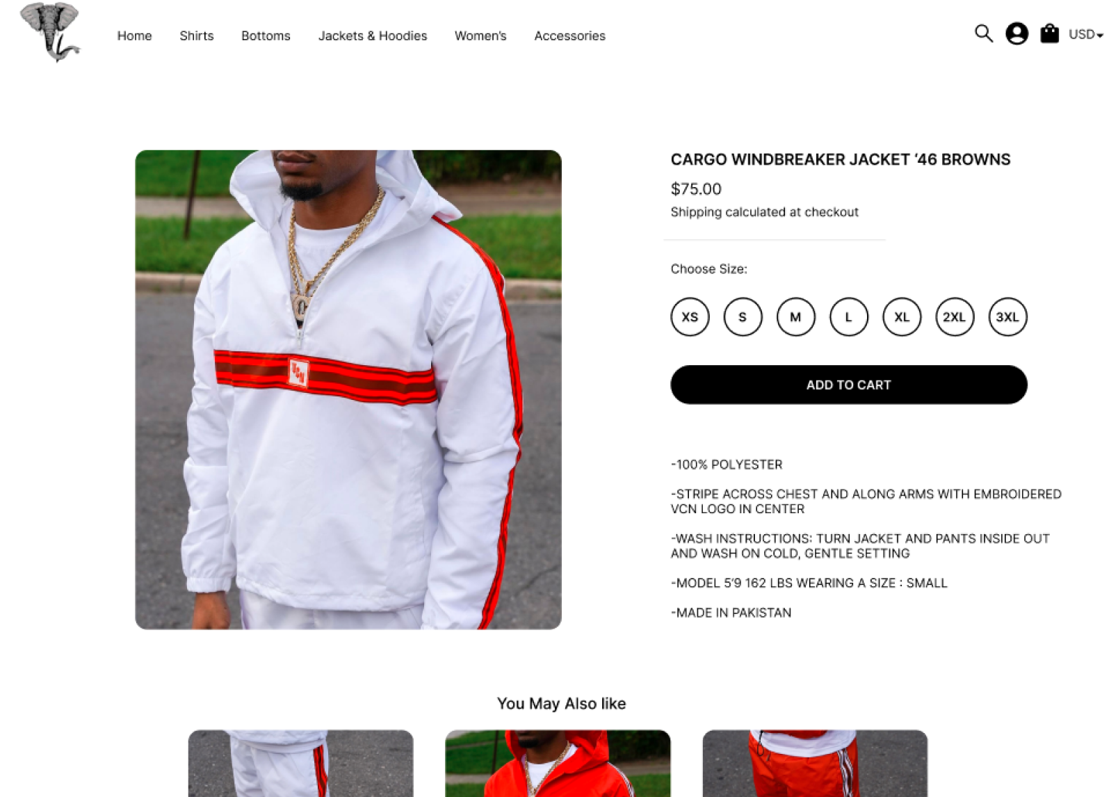
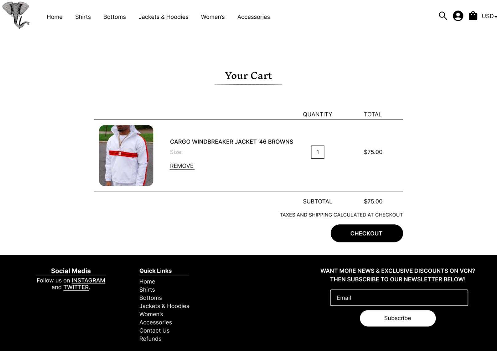
The redesign focused on creating a more intuitive, structured shopping experience. I introduced clear product categories , a persistent and minimal navigation bar, and visual hierarchy to guide users through the shopping journey. The homepage was restructured to highlight featured collections, new arrivals, and sales with prominent CTAs.
Additionally, I implemented a simplified product grid with filtering options and a responsive layout. The goal was to reduce friction, improve product discoverability, and ultimately boost user engagement and sales.

Conclusion
The redesign of the VCN Clothing website transformed a cluttered, hard-to-navigate experience into a streamlined and user-friendly interface. With improved navigation, better product organization, users were able to find what they needed faster and with less effort.
This project reinforced the value of user-centered design and clear information architecture in e-commerce. If expanded further, I would look to integrate customer reviews, real-time inventory indicators, and personalized product recommendations to drive even more engagement.